My Product Design Process – Gratitude Journal App
In this post I present my design process for going from a product concept to a finished app design.
I’ll be using a concept that was inspired by a quote from one of my user testing sessions of mood tracking apps. One of the test participants described to me how he is currently using a mood tracking app Daylio:
“[in the app] I can see what I do that makes me happy, I go to calendar, I can just scroll down and see when was an awesome day.
Okay so this is a 4 day streak where I felt awesome and exceptional – I can see what I did, I worked out, I had a date, these are the things that I did that made my day awesome so I can just learn from my habits.
I try to note only the positive so when I read it back I only see what’s good. Well I guess I use it as a gratitude journal also, which is good to destress.
And you see, one realisation that I had is that when I saw bad entries, when my mood was bad, and I realised when I reread these entries that hey I don’t even remember this, I don’t even know what it was about.
When you are in something you really feel so overwhelmed by that, but after a while it will just wash away so fast that you won’t even remember.”
This inspired me to think about how mental health apps could support people in appreciating all the good things that happen to them and ultimately get more balanced perspective on their lives. Initially I was going to design a simple gratitude journal but as I was thinking through the initial ideas, I realised that typing long journal entries is quite a lot of effort and is not the most efficient on a tiny mobile keyboard.
And since more and more users are getting used to expressing themselves visually – due to a popularity of image-based platforms like Instagram or Snapchat – I decided to incorporate some of those image-driven patterns into the gratitude journal concept.
The purpose of this post is to showcase product design process – so we’ll make an assumption that the value proposition has already been tested and we have conducted enough user interviews to confidently proceed with the design of this concept.
Here’s a preview of what the final design looks like:
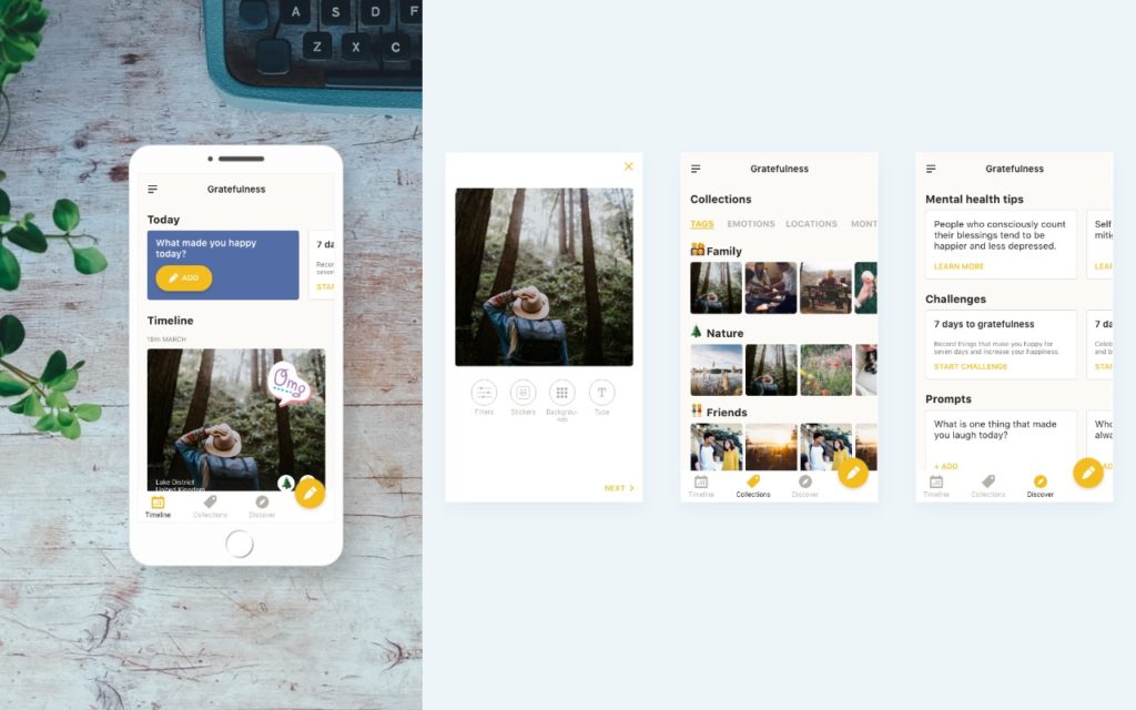
So, let’s have a look at the steps involved in bringing a product concept to life.
1. PROJECT KICK-OFF
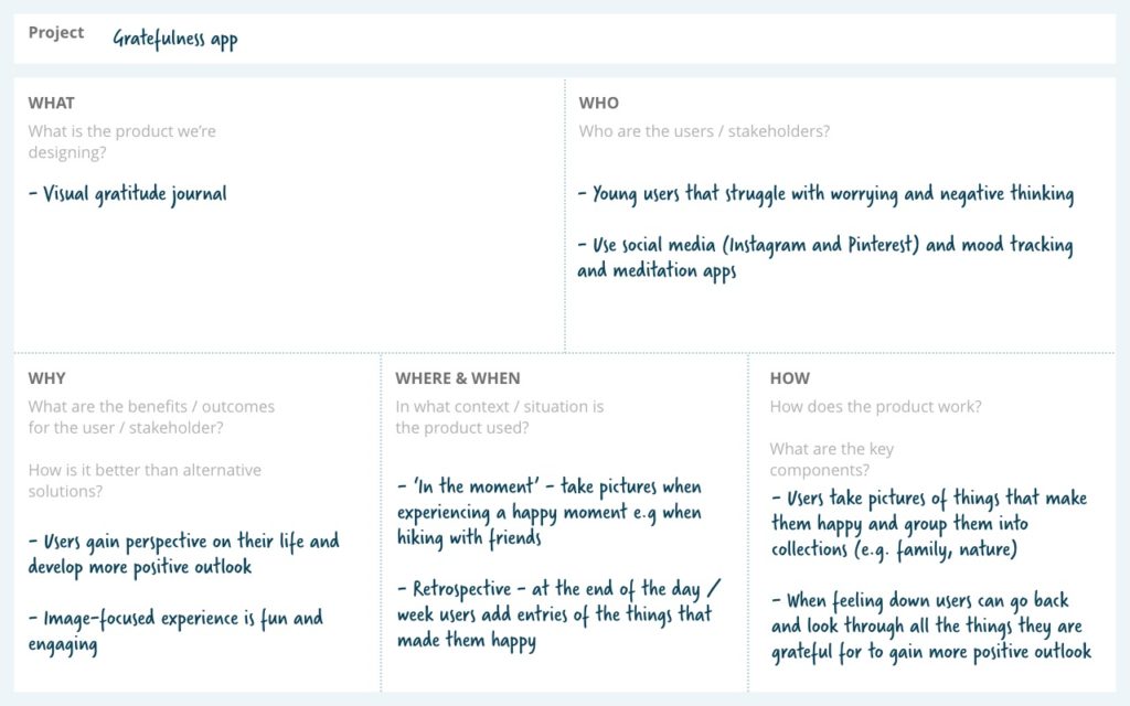
A good way to start a new project is to use a ‘5 Ws and H’ framework. I first learnt this method from a fellow user researcher when I was contracting for the Co-op. At the start of a new project he would ask the team members to answer 6 basic questions – why, who, when, where, what and how. I have since adapted the template to make it specific for the product design projects:
WHY – why are we doing this project? How will the user benefit? How will the business benefit?
WHO – who are the users? Who are the stakeholders?
WHAT – what is the product we are designing?
WHERE and WHEN – in what context / situation will the user interact with this product?
HOW – how does the product work? what are the core steps and elements?
A the start of the project the answers to these questions are largely based on assumptions but it helps to align everyone around a single goal and make sure the team starts off on the same page.
Here is the template filled in for the gratitude journal app:
2. EMPATHY MAP
Empathy maps help you visualise how and in what context users are likely to interact with the product, and what questions and concerns might be running through their heads. Users’ goals and pain points are also crucial elements of empathy maps – having an awareness of those will help you create a product that solves real pain points and provides real value (based on what users are actually trying to achieve).
Here is a filled in empathy map for our gratitude journal user:

3. PERSONA MOODBOARD
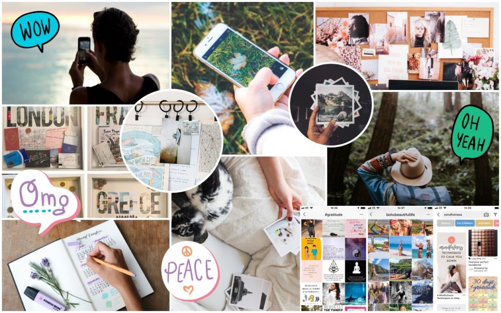
This is an optional step but I found that representing the user in a visual way really helps me to empathise and ‘get a feel’ for what that persons’ life might be like.
Persona moodboards are less about demographics and how the person looks, and more about the context and environment.
For our gratitude app user I started off with users goals from the empathy map and searched for images that would represent their environment (e.g. decorating walls with pictures of friends a family), what kind of tools they use to fulfil their needs at the moment (e.g. paper journals, photos on the walls) and the activities they might want to record in the app (e.g. hiking).
4. USER SCENARIO AND REQUIREMENTS
Writing user scenarios is a very powerful way to transition from understanding the user to envisioning the solution.
Scenarios use context and storytelling to describe users’ ideal interaction with the product or service. This helps to design products that fit perfectly in users’ lives.
Storytelling helps to come up with realistic use cases and anticipate the problems users might come across.
At this step I keep the scenario at a fairly high-level. The product is meant to be a ‘magic box’ that just delivers whatever the user needs at every step of the journey.
You can have a lot of fun with this step too – you can incorporate creative ways of writing, e.g. using traditional ‘hero journey’ writing framework or write them up as a ‘day in the life’ of your user.
To go from the scenario to product requirements I highlighted all the areas that indicate there might be a UX requirement. These could be data and content requirements (what the product needs to show to the user) and functionality (what it needs to enable the user to do).
Here is the scenario and the requirements for the gratitude journalling app:
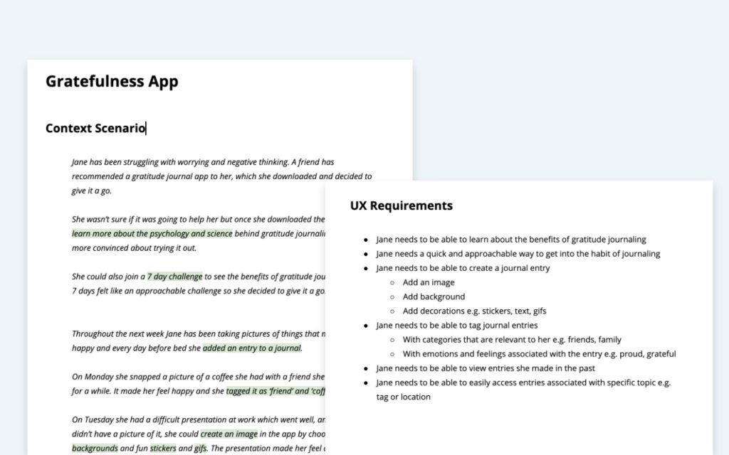
When writing up the requirements, it’s important to record them in the form of user needs, rather the specific features or solutions.
This is because each user need can be fulfilled by more than one potential solution. For example, the user need to learn more about the benefits of gratitude journalling can be fulfilled by:
- an animated video about gratitude
- tool tips with information throughout the interface
- articles
- video of someone explaining the core concepts
- interactive trivia quiz
- …
By writing the requirements in terms of needs rather than solutions, I leave myself enough space to brainstorm potential solutions in the later stages of the project, without yet committing to the specific UI elements.
5. INSPIRATION / BEST PRACTICE RESEARCH
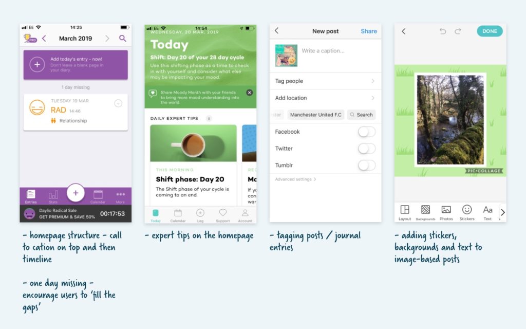
Once I have a list of requirements, I research how other products solve similar problems. Using interaction design patterns that users are already familiar with enhances the usability and it gives me enough of the inspiration to make sure I explore all the possible concepts.
It’s important to look further than immediate competitors for the product we’re designing – sometimes the best solutions are created by borrowing from unrelated fields and disciplines.
For example, for the gratitude journalling app I looked not only at other mental health apps but also at Instagram and apps for creating picture collages.
6. SKETCHING, USER FLOWS, NAVIGATION
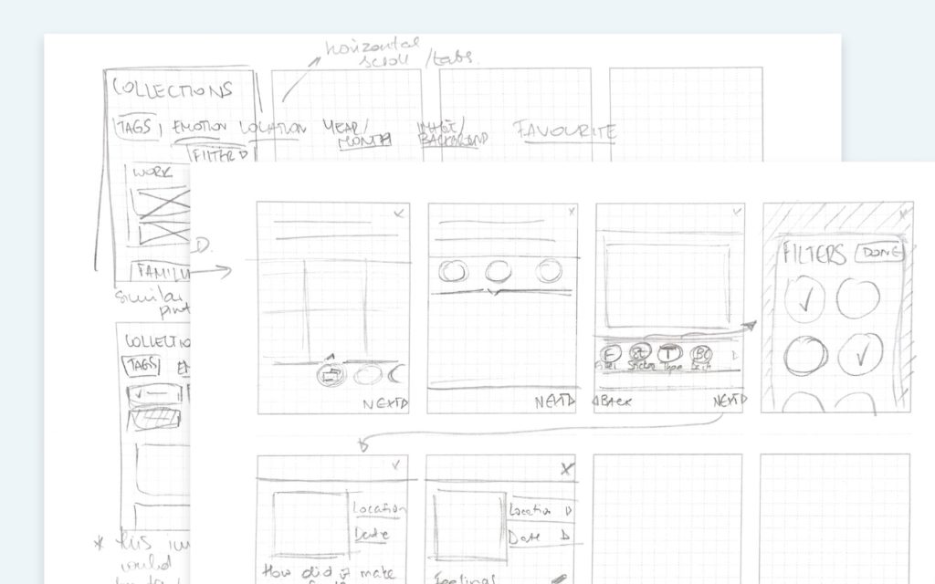
Next I start sketching out ideas for the interface.
There isn’t a set order of steps, sometimes it makes sense to start with a card sort and come up with the information architecture (navigation) first. At other times it make sense to start with sketching out the UI ideas.
In this case I started with writing down the flow for the ‘add journal entry’ since this is the core functionality of the app. From there I sketched out different ideas for the UI and the information architecture emerged as a result.
7. WIREFRAMES
Once the key screens are sketched out, I start finalising the interaction design in wireframes.
Starting with basic wireframes of the screens (usually greyscale and one colour for interactive elements) allows me to focus on the functionality and user flow without being distracted by the visual design.
This stage is a significant milestone in the project.
It’s essential to get client feedback and the sign-off on the functionality and user flows before proceeding to the visual design phase.
Similarly, it’s a great time to do user testing on wireframe-based (low or medium fidelity) prototype.
The wireframes stage act as a gateway to the next stages (visual design and development):
Does it meet the goals of the business? – client sign off
Does it meet the needs of the user? – user testing
Is it technically feasible? – developer feedback
If yes – proceed to next stage. If not – iterate and retest until you get it right.
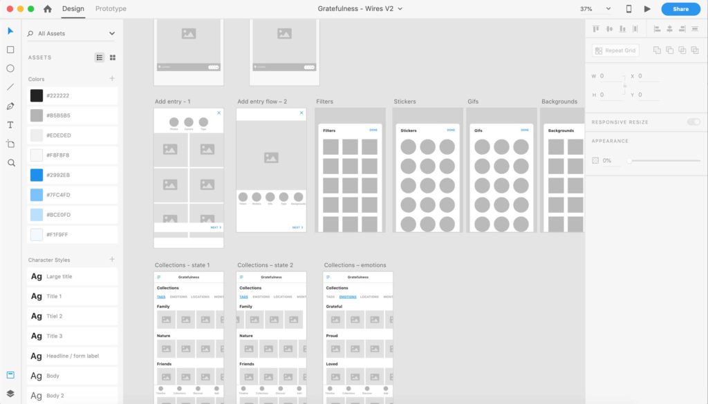
Check out the clickable wireframe prototype:
8. VISUAL UI DESIGN
Once the functionality and user flows are finalised, I start working on the visual UI design.
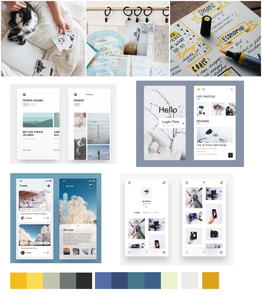
Starting with a visual design moodboard is a great way to align the vision and the expectations with the client.
For the gratitude journal app I incorporated inspiration from the persona moodboard and searched for UI design examples that I felt would resonate with the target user.
From the client side, the moodboard would also incorporate the brand adjectives they wanted to represent (e.g modern, friendly, sophisticated etc) and any existing brand guidelines.
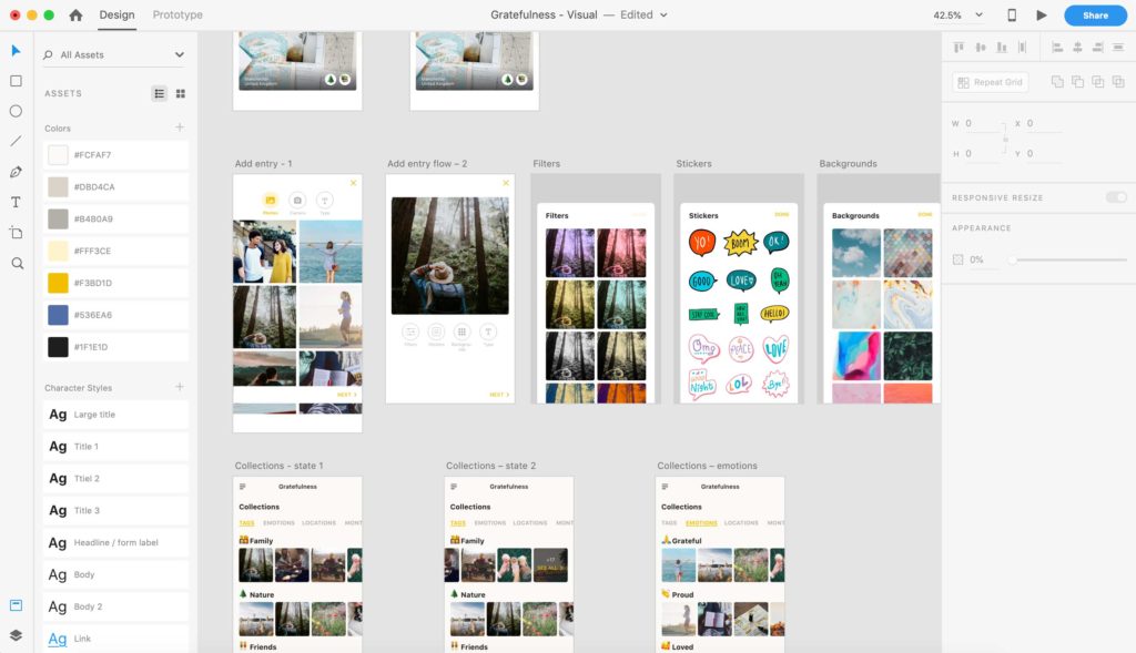
For our gratitude journal app, once I had the moodboard to set the direction for the visual tone, I started amending the wireframes to incorporate visual style and tone. At this stage I also finalised the high-fidelity prototype.
And finally, here is a click-through of the prototype:
And the prototype itself:
Closing thoughts
To summarise, my process for going from a product concept to app design includes 8 key stages:
- Project kick-off
- Empathy map / persona + optional persona moodboard
- User scenarios and requirements mapping
- Inspiration / best practice research
- Sketching, information architecture and user flows
- Wireframes
- Visual UI design
Additionally, to avoid expensive mistakes and developing wrong solutions, it’s recommended to user test wireframe or low-fidelity prototype before finalising the design.
Do you need to create an MVP for your health app idea?
I work with healthcare startups to help them create digital health products users will love, want and use.
I work collaboratively with clients and I will guide your through the process from the concept to finished app design. Learn more about my services here or get in touch on contact@panacea.digital and let’s talk about how I can help you bring your vision to live.

