
Common UX / UI Mistakes Made in Fitness Apps
With the number of health and wellness apps constantly growing in app stores, intuitive and friction-less fitness app UI and UX design becomes a crucial competitive advantage. Users downloading a new app, instantly evaluate whether it meets their expectations, and when a clunky or cumbersome interface becomes an obstacle, they’re more likely to leave the app and look for other solutions.
In order to understand what UX / UI design patterns work and don’t work for fitness app users, I’ve conducted an independent user testing of three popular fitness apps.
In this article, I present some the common UX / UI mistakes made in fitness and workout apps.
Tested apps
- Fitbit Coach
- 30-day Fitness Challenge
- Seven – 7-min Workout
Test participants
Total number of test participants: 15 (7 male, 8 female; 19-60 years old)
All participants included in the test indicated that they workout at least once a week, to make sure that they fit the target audience for fitness apps.
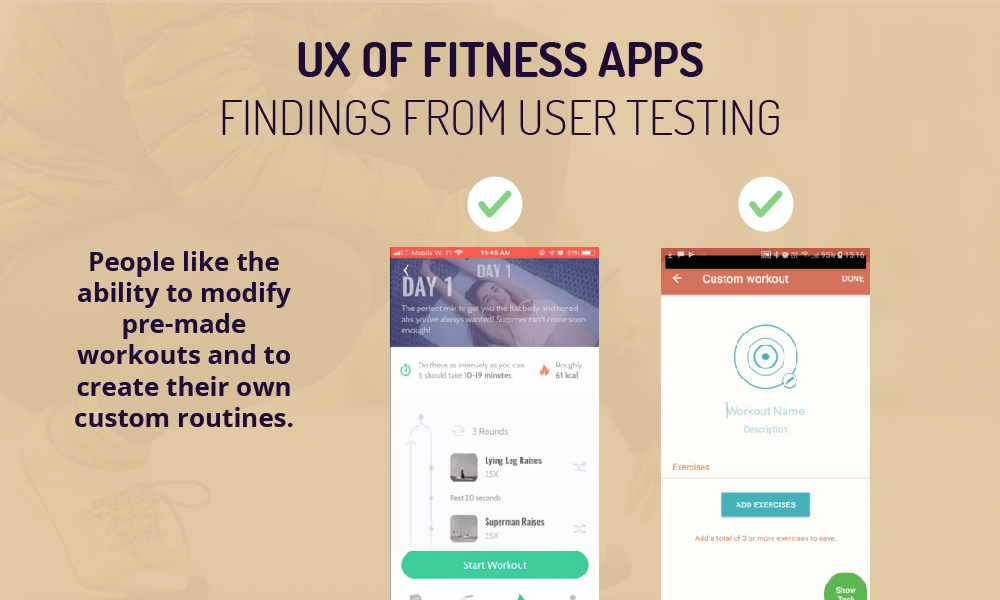
Mistake 1: Not allowing users to customise their recommended workout plans
Most fitness applications that offer workout plans have a recommendation engine in place or customise workouts for the user based on the information they entered.
Our user testing of fitness apps showed that people enjoy the personalised aspects of those fitness apps, but most would need the ability to add modifications to recommended plans.
This is due to either personal circumstances e.g. temporary injury, a preference for a specific type of exercise or personal fitness goal.
User testing quotes
“I wish it asked me specifically about my body type already… because I like my legs, it’s upper body that I want to work on. I wanted to know if it can be more personalised.”
Participant 1, user testing of ’30 Day Fitness Challenge’ app
“I can’t do those exercises because of my shoulder injury… is there a way to add modifications? Doesn’t seem like there is…”
Participant 5, user testing of ’30 Day Fitness Challenge’ app
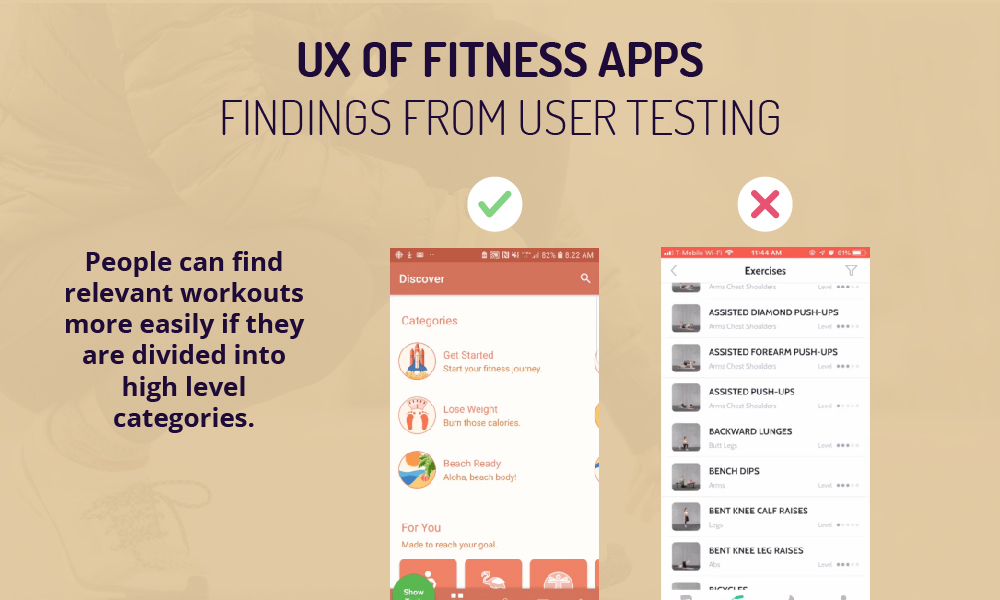
Mistake 2: Not providing sufficient browsing and searching functionality to support users in finding relevant exercises
Only one out of the three tested applications supported search functionality for their exercise libraries, and only one divided their exercises into higher-level categories (e.g. by body parts) that users could browse through. In most cases, users struggled to find specific exercises as it required them to scroll through a very long list of individual exercises.
Following on from previous point, users that downloaded an app with a specific goal in mind and users looking to add modifications to their recommended plan are likely to struggle with completing those tasks.
User testing quotes
“I really didn’t get any filter or anything that would tell me which exercises will improve my abs, I have to assume it myself then.”
Participant 3, user testing of ‘Fitbit Coach’ app
“I wish there was a search option. It would be helpful to have a search option or a topic for injuries.”
Participant 3, user testing of ’30 Day Fitness Challenge’ app
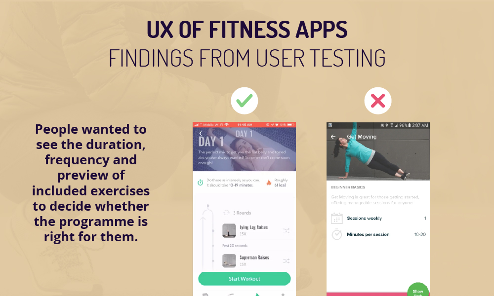
Mistake 3: Not providing enough context in workout name and description
In two out of three tested applications, users struggled in deciding which workout plans are right for them based on the available descriptions.
In ’30 Day Fitness Challenge’ app, workouts are named by cities of the world. Although users are able to filter workouts by body part and intensity, all users that entered the ‘Workouts’ tab, noticed the unfamiliar workout names and clicked away immediately without further browsing.
In ‘Fitbit Coach’ app the user can only see brief description of the workout. To access the rest of the information, the user would have to subscribe, but the brief description doesn’t give them enough confidence that the workout is right for them, therefore they don’t know if its worth subscribing.
User testing quotes
“Abu Dhabi? Okay these workout are very confusing…”
Participant 5, user testing of ’30 Day Fitness Challenge’ app
“It doesn’t say what it is, is it cardio? Is it weights? Choose any programme… Aha I guess I can just choose, but can I choose the ones that are longer than 10-15 minutes or are they going to limit m to the ones that are 10-15 minutes?”
Participant 1, user testing of ‘Fitbit Coach’ app
What’s next?
These are just some of the findings from our user testing of fitness apps.
Download full research report or sign up for a monthly research insight on the user experience of fitness apps.